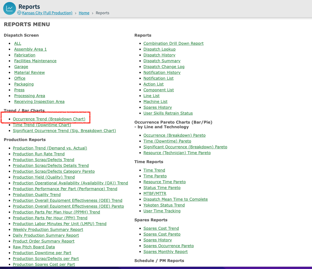
If you want to understand, at a high level, what your trend is for a certain dispatch type or breakdown in order to determine where you should start problem solving, the Occurrence Trend is a good place to start. The Occurrence Trend is in our Reports Menu screen:
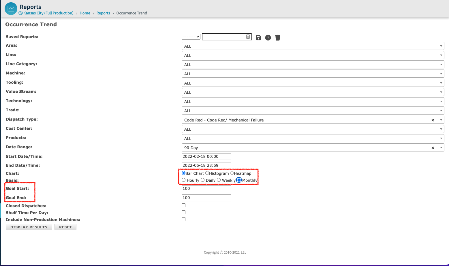
When you open the Occurrence Trend, you will have all of the normal options to filter your results down more specifically by Area, Line, Machine, Trade, Dispatch Type, and Date Range. Once you create your chart, you can save your filters and schedule the report to be run and delivered to you or your team.
Additional items:
Goal Start/Goal End: you can set a goal line for your report and the system will draw a straight line connecting the two values entered in Goal Start and Goal End.
Shelf Time Per Day: Allows user to query a slice of time over a period of days. Select a date range and a time (i.e. 06:00-08:00) and select Shelf Time Per Day to receive data between those hours for the Date Range you choose. *This is helpful if you are looking at measurements and trends for specific times of the day across a range of days. For example, you want to see how shift changes impact production. The same is true of breaks, lunches, end of shift, weekends, etc.
Closed Dispatches: Allows user to retrieve only Dispatches that are "Closed".
Include Non-Production Machines: Allows user to retrieve Dispatches from Non-Production Machines. *TIP: this is often overlooked and is frequently the culprit when returned report results don't reflect what you were expecting to see.
There are 3 choices for the type of chart to select from and will show examples of each with a goal line inserted:
- Bar Chart
- Histogram
- Heatmap
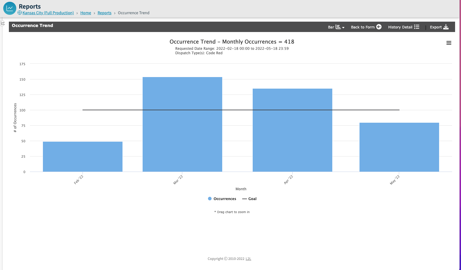
Bar Chart – this is the typical pareto bar chart. You can select how the x-axis is set up either hourly, daily, weekly or monthly. Below is a monthly example:
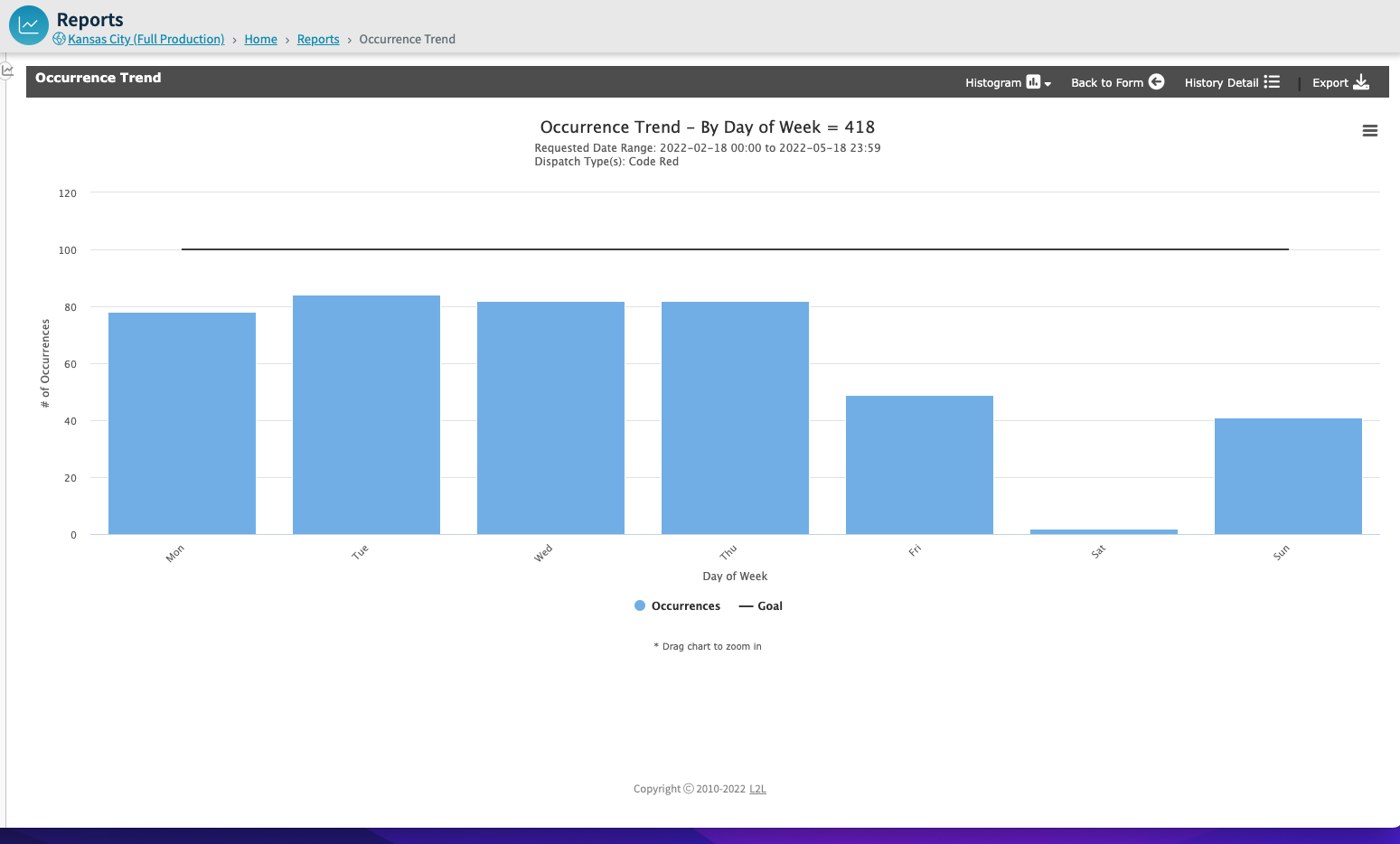
Histogram – the histogram is used if you want to drill down and determine the number of occurrences in a specific minute, hour, day of the week or day of the month. This is particularly helpful if you are looking for impact of a certain dispatch at the start or end of a shift. Below is an example with Day of the week chosen:
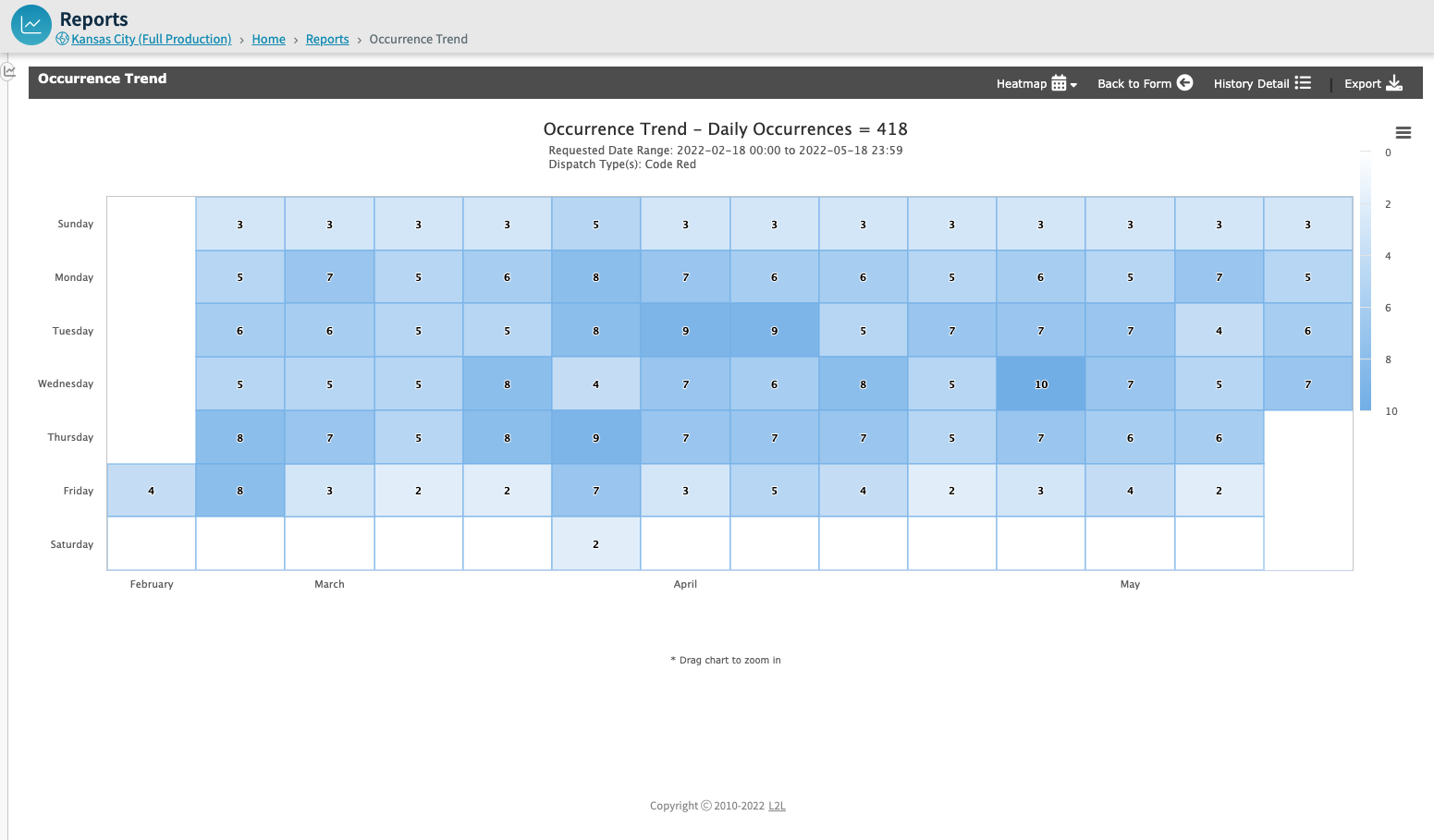
Heatmap – the heatmap provides another visual means to see the data where the colors of the map indicate the higher occurrences. Note: the maximum date range that can be selected for the heatmap is 3 months
In the upper right of each of the chart types, you can change the chart type, can go back to the form to make any changes, and you can get to the dispatch history of the chart data and can export the data.