4.24.26 New Dispatch UI & API Documentation Fix

Dispatch
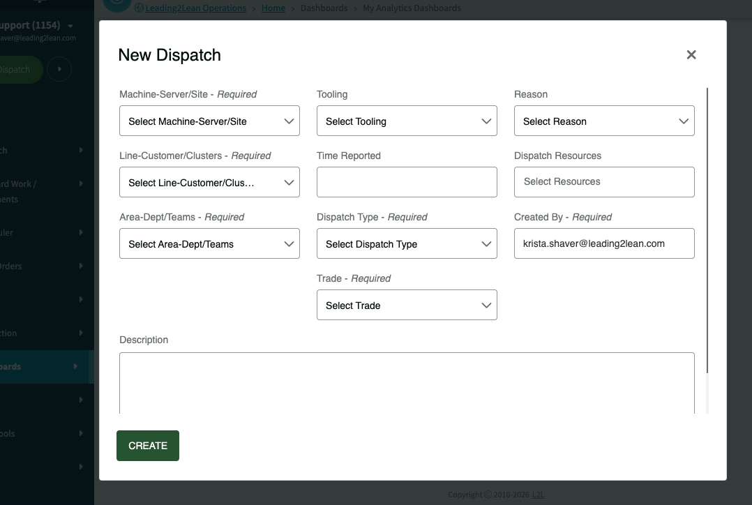
The New Dispatch dialog has been redesigned for mobile and tablet devices (however you'll notice the difference on a desktop too!) to ensure action buttons remain accessible and visible even when the on-screen keyboard is active. Key updates include a full-screen layout with a pinned header and footer, alongside optimized dropdown selectors that feature search icons and improved text truncation for faster navigation on smaller screens.
API
We've updated the API documentation for the params_use_codes parameter in the Documents add, modify, and list_bycategory methods to correctly reflect that a value of 0 uses IDs and 1 uses codes.
-
Official comment
Thanks so much for providing feedback to help us improve! I've passed along your feedback to our Product team for review.
Thank you,
Krista
-

Nice!
Already got some feedback on the update.
Is it possible to expand the window automatically by default so all the information is visible? Or optionally redesign the layout so all information fits in the window. As now, you must scroll down to see if there are any dispatch questions.
1 -

Some feedback from our techs already aligns with what Mattias stated. The additional dropdowns are cumbersome on our tablets. Less is more (Required Only), in my opinion, when it comes to the initial dispatch creation as these usually take place in the field.
0
Please sign in to leave a comment.
Comments
3 comments